The Psychology of Color: Colors and Branding Tips for Your Business Success

Color Psychology Definition and Color Psychology Marketing
Color psychology marketing has been a controversial topic for many years. The meanings of colors are much deeper than anyone can imagine. Marketing in color is not as simple as just picking color scheme ideas based on general knowledge. For example, Gregory Ciotti at Help Scout correctly points out that color meanings – especially in marketing – are more complicated than a simple ‘see ‘n say’ notion. For instance, the usual brand color for pencils is yellow and we also associate this color with happiness. This color symbolism (color yellow = happy, purple = angry) is something similar to palm reading with no background knowledge.
Color combinations may have a varying impact on the viewers depending on their ethnic background, state of mind, experiences, preferences, upbringing, and simply the context, in which one views the color. However, smart color palette ideas will definitely have a positive impact on anyone interested in the brand that effectively uses color. The trick is to view the spiritual meaning of colors practically and use it wisely.
Psychology of Color: The Branding Color Palette
Any color infographic will teach you that consumer behavior is driven by color in branding, and the strongest impact is produced by such colors as yellow, purple, red and orange. However, let’s look at how the brand can capitalize on the knowledge about its target audience and use colors to convey the correct message.
The truth is harsh: color is too personal when it comes to feeling. There are, however, general patterns of color associations and branding color schemes which either ‘fit’ the brand or not. These branding colors can be discovered by studying your target audience, their backgrounds, age and sex group, and other personal factors. Also, brandcolors have fleeting but powerful snap effects which indeed greatly affect purchasing intent and behavior. Who would want to buy a Harley-Davidson in pink color, right?
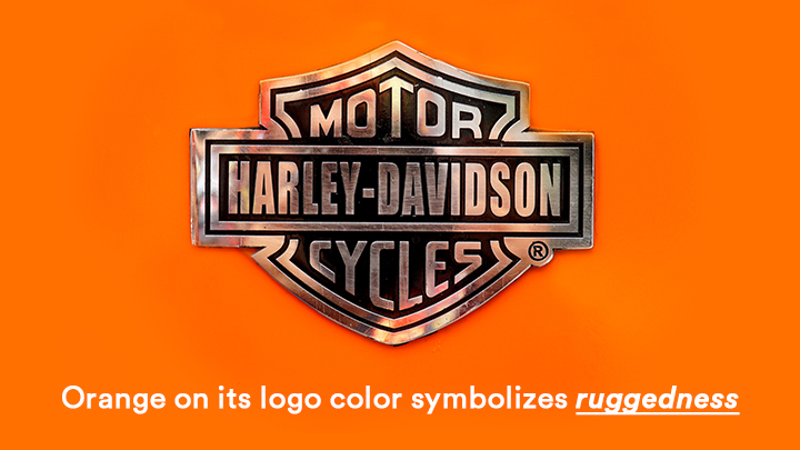
Your brand color palette will largely depend on the message that you would like to convey with the help of your offering. For example, Harley-Davidson uses orange as its logo color because research shows that this color symbolizes ruggedness. For the color of motorcycles, the colors that go with orange and reinforce the message of ruggedness – mostly black shades – have been chosen. This is color coordination in action. Such logo color schemes that have a certain idea behind them work well.
A lack of colors is definitely hurtful to a brand because there is no clear positioning with respect to the competitors. A suitable brand color diagram can be well based on the choices of competitors – however, it must evoke a correct emotion, and here is where color research steps in.
Colors and Branding: Brand Colors for Your Business
The color meaning chart designed by the Stanford professor Jennifer Aaker in her color study portrays 5 main dimensions associated with the personality that color may convey in the brand:
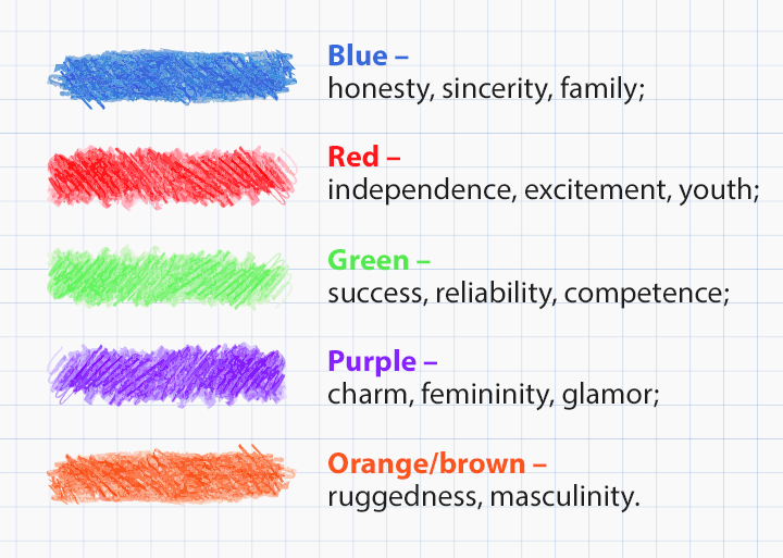
However, colors and branding are not as easy to manipulate as just using these power colors with no message whatsoever. History proves that successful color use in branding means showcasing with the chosen color the real personality behind the brand, not a generally accepted one. Even though according to mood color charts, green is the color of reliability, let’s not forget that it’s also the color of environmental activism and… money. Green is one of those interesting colors which can be used by the most different brands and still be very powerful from a brand psychology standpoint. Another common color-specific question is “what color represents hope?” and, according to the surveyed tastes of consumers, that would be green.
One more vivid color psychology definition may be portrayed by the color brown. However, according to the color emotion guide, it symbolizes masculinity, we still know many Thanksgiving and simply chocolate commercials which state otherwise – brown is the color of family and sweetness.
Black color meaning, even though not studied by Jennifer Aaker, carries some association with power, and sophistication, as other research suggests. However, it’s also the color carrying the meaning of something special and nowadays it’s very often successfully used in fashion branding, especially its edgy type.
In such a way, colors in advertising have no clear-cut rules: the main trick is to strive to showcase the personality of the brand that is to be revealed by the chosen color. When choosing marketing colors for your brand, it’s also important to research possible negative connotations as they may not be as apparent. For instance, even though the brown color is associated with ruggedness, or – in other cases, with the homey feeling – there is reliable evidence to suggest that in some context, brown has negative connotations among the viewers.
In short, color emotions are fast and fleeting, as well as often subconscious. This fact must be considered when choosing branding color palettes.
Women Colors and Men Colors – Gender Preferences
There is some striking and significant research on the preferred by men colors and preferred by women colors. The book by Joe Hallock entitled Color Assignment is a collection of such research suggesting some patterns in the colors liked and disliked by both genders in Western society. For instance, Hallock has found that both genders like blue as the color of trust, but there is a noticeable statistical difference when it comes to the preferences regarding the purple color.
When targeting different genders, the corporate color palette must consider the cultural backgrounds as the primary factor.
Let’s see which marketing colors are preferred by both genders, according to Hallock:
Men:
Blue (57%)
Green (14%)
Black (9%)
Red (7%)
Orange (5%)
Grey (3%)
Brown, white, yellow (2% or less)
Women:
Blue (35%)
Purple (23%)
Green (14%)
Red (9%)
Black (6%)
Orange (5%)
Brown, yellow, white, grey (2% or less)
The choice of colors and differences among genders may seem reasonable, but there are some additional behavioral peculiarities to consider. For one, women are known to differentiate more variations of colors and therefore they prefer softer shades, rather than bold ones, as men do. Additionally, there is some correlation between color and emotion as women prefer tints of colors (lighter colors) but men prefer their shades (darker shades). This behavior is also referred to as color wheel theory. How does this information apply to branding? It’s simple: use pink for women and crimson red for men, if opting for a red color palette.
Here are certain business colors which are less preferred between both genders, from the least preferred ones with higher percentage:
Men:
Brown (27%)
Purple, orange (22%)
Yellow (13%)
Grey, white (5%)
Blue, green, red, black (2% or less)
Women:
Orange (33%)
Brown (20%)
Grey (17%)
Purple (8%)
Green, white (5% or less)
Considering the surveyed tastes among men and women, the color branding for a traditional brand is obvious. However, another important consideration is the fact that some popular brands who have been breaking these rules have been successful, too. Coming back to Harley-Davidson whose color psychology as a brand is theoretically wrong – but very effective in practice. Yes, orange, brown and black are some of the least enjoyable colors for both men and women – however, with Harley-Davidson’s personality, these colors mix and match perfectly and help the brand achieve its targeting and positioning goals in the market.
Colors in Advertising: Why They Matter
Putting it all together, color emotions do exist, and, for a large part, they are subconscious. What this means is that people cannot really answer honestly a survey question as to which color they prefer and why. However, the research does make a few important discoveries with regard to the colors that make people buy. Some of them are listed below:
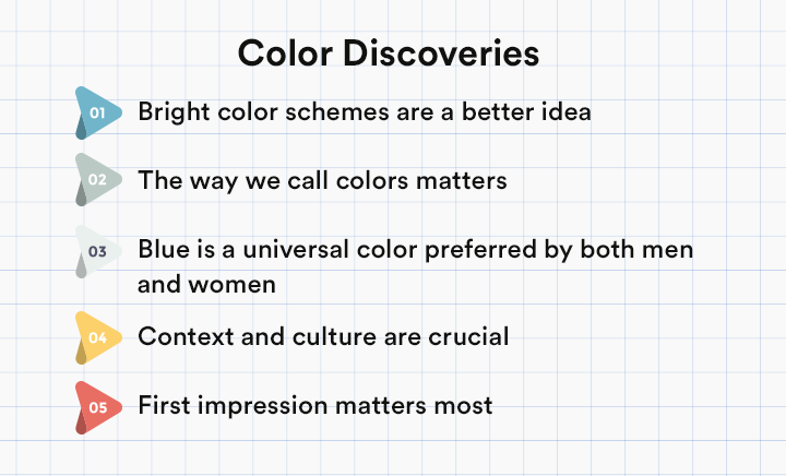
- bright color schemes are a better idea because they call for more attention. Especially among men, bright shades of colors are effective. Bright colors are also effective for both genders just in terms of grabbing attention and standing out from the competition;
- the way we call colors matters – “sky blue” is better than “blue”, and “mocha” is better than brown. In fact, the research has shown that brown color does have a negative connotation among some people so calling it something more likable is definitely a great idea;
- blue is a universal color preferred by both men and women – however, when choosing this color, make sure to do some product-specific research because blue is also known to repress hunger. So, when choosing a color for a food product logo, blue may not be the best choice;
- context and culture are crucial – make sure to study your target audience and understand their personal likes and color preferences in simple life situations;
- the first impression matters most when it comes to the color. Make sure to understand what kind of the first impression the colors on the brand’s logo may connote within a person’s mind;
All in all, having analyzed some research-backed ideas and survey results, there is one more great tip for every young and aspiring brand out there: don’t be afraid to break the rules and enjoy it, just like Harley-Davidson did with its brand logo colors!